Popsical
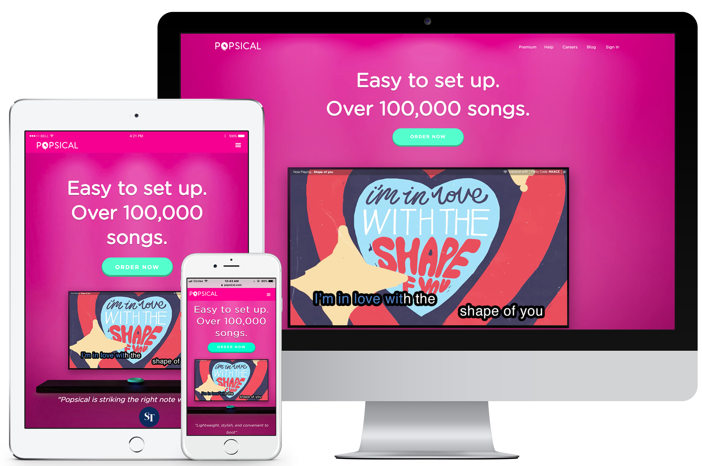
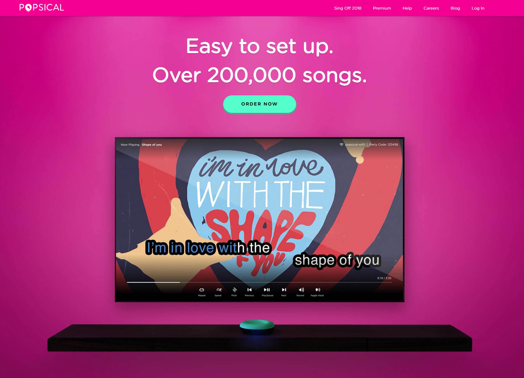
Redesigning Popsical's (a karaoke device) e-commerce website to meet branding guidelines and reach sales goals.
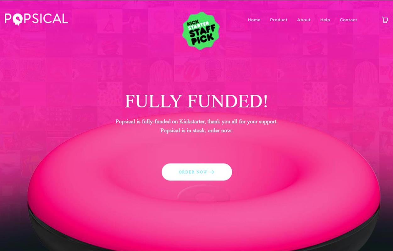
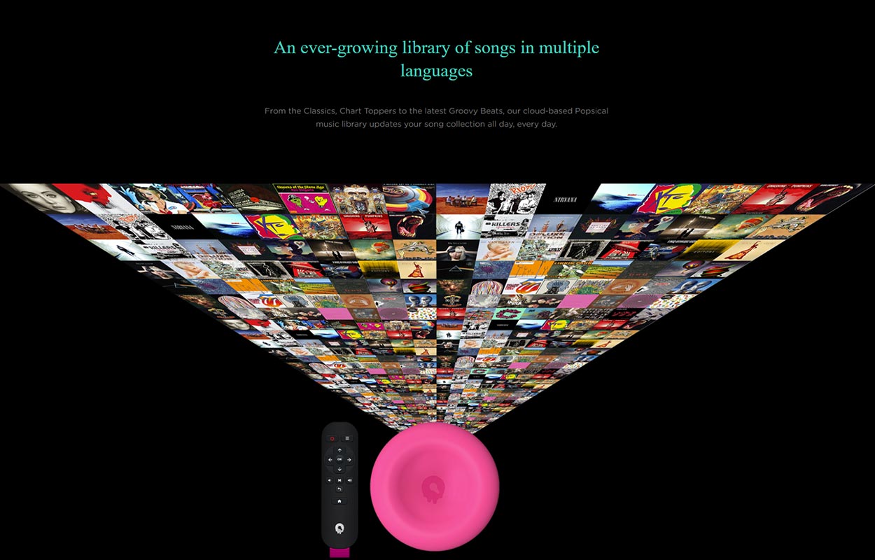
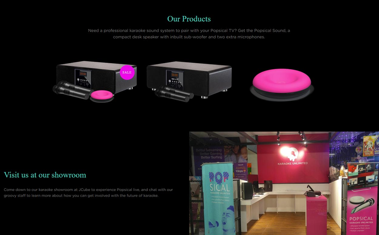
The Goal
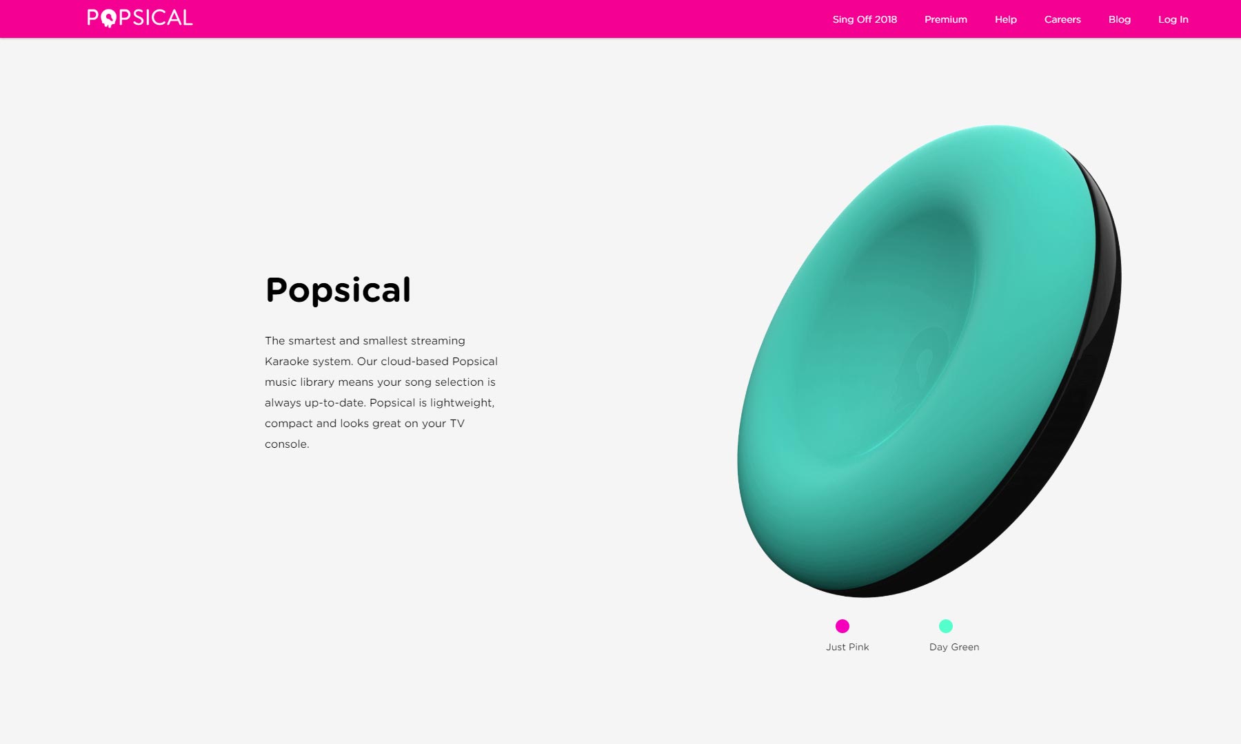
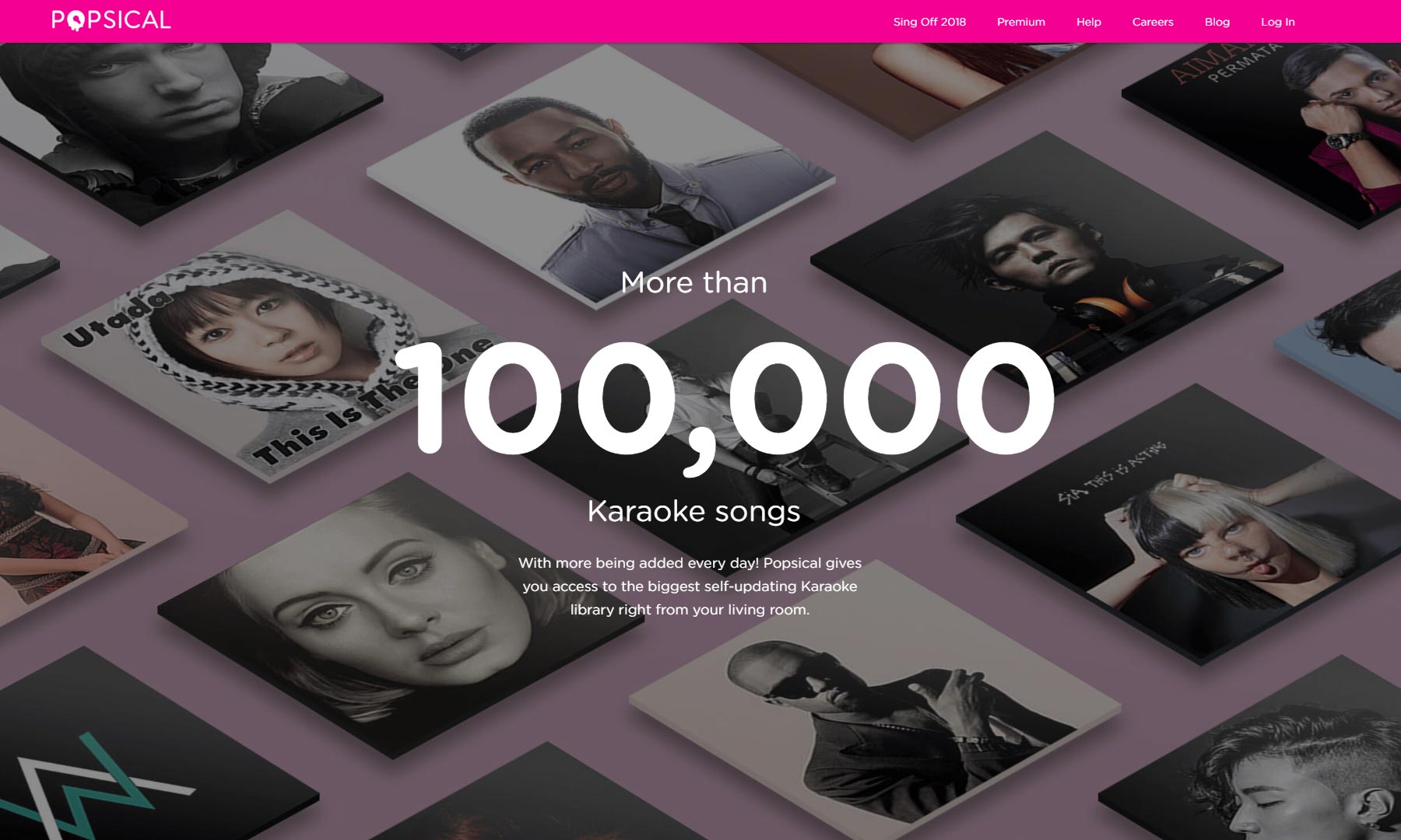
The goal was first and foremost to redesign the website to increase sales. To do this, the website has to be aesthetically pleasing and professional to foster confidence in prospective customers. The browsing, buying and checking out experience needed to be as simple and straight-forward as possible to prevent prospective customers from dropping out. More pages had to be created to contain detailed information that was not available on the landing page. All of these pages had to be responsive so that customers can browse and check out on the go.
Old Design
Popsical's initial e-commerce website was not aesthetically pleasing and lacked a cohesive design language. While the goal was to increase sales, the call-to-action button was overshadowed by every other element in the hero section. There was also no clear buy button in the products section on the bottom of the page. Overall, the website's first impression does not exude professionalism nor capture customers' trust
My Role and Tools Used
- Wireframing
- Creation of graphic assets
- Copywriting
New Design
Outcome
Since the site revamp, the goal of increasing online sales was successfully met. Up to date, 40% of total transactions are made via the Popsical e-commerce website alone.
