Razer Game Store
Razer Exclusives' Landing Page Redesign

Goals
- 1st Goal: To educate users on Razer Exclusive so that they are aware of the incentives available.
- 2nd Goal: To boost sales
- 3rd Goal: To get more user sign ups
- 4th Goal: To achieve a more professional look that is consistent with the Razer branding.
My Role and Tools Used
I was involved in wireframing, usabilility testing, graphic asset creation and copywriting
Tools Used
- Sketch and Adobe XD (User Interface Design)
- Adobe Photoshop (Asset Creation)
Old Design
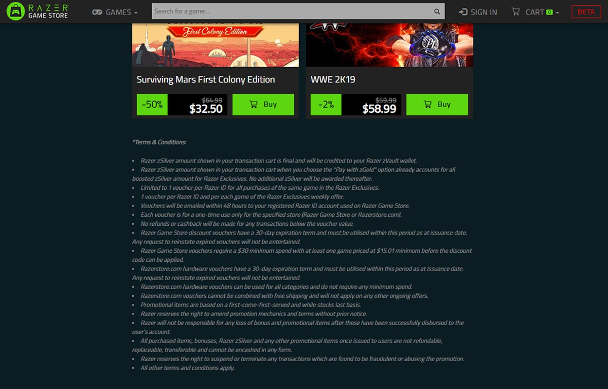
To get an idea of what users feel about the old design, I conducted a quick usability testing with 5 users.


Too wordy
- There was no clear visual hierarchy to bring focus to the important points.
- Users did not realise that there were vouchers and zSilver incentives despite the information being stated at the start. They skimmed through the first section and did not attempt to understand it fully.
- Some only realise after reading through the website after a couple of times.
- Naturally, all users did not read the terms and conditions although some points were rather important.
Not Aesthetically Pleasing
- Most felt that the page's design was not aesthetically pleasing and lowered the professionalism.
- Some did not recognise the page as being part of Razer as the page was not consistent with Razer's branding.
Wireframes and High Fidelity Mockup
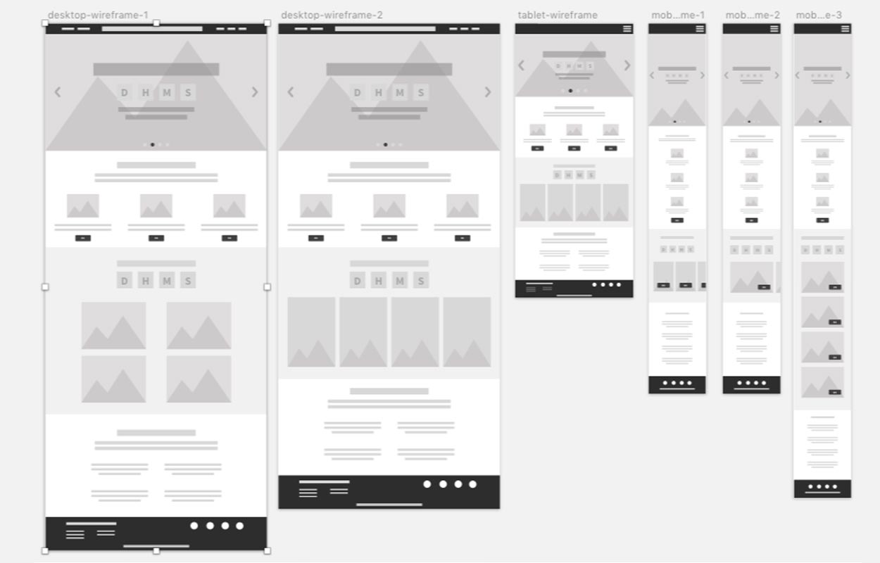
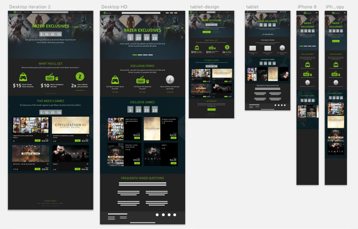
Due to time constraint, I used a wireframe kit for Sketch. This allowed me to produce wireframes and transition to creating high-fidelity mockups at a faster rate.


Final Design
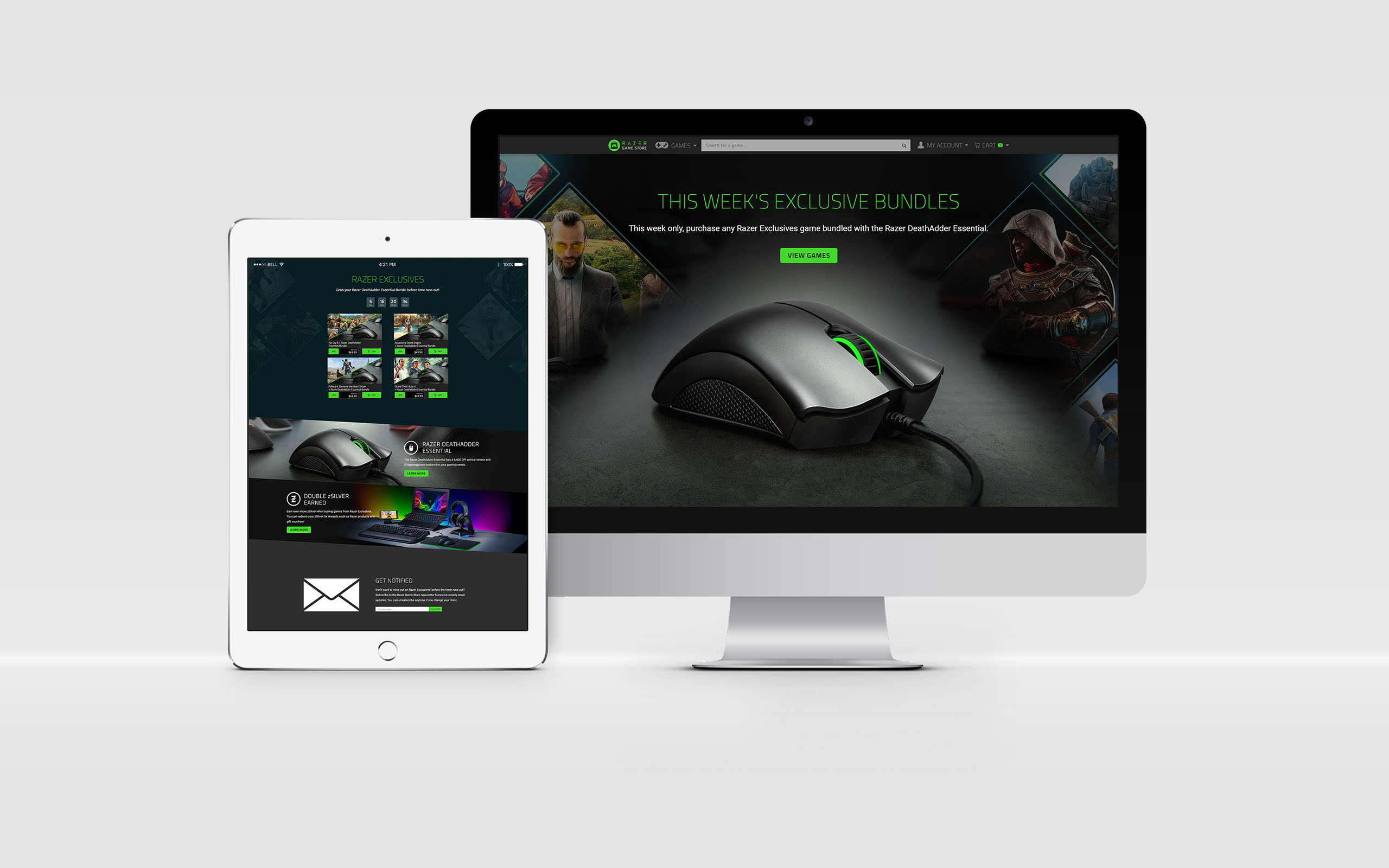
Along the way, the page had to be further iterated to meet the requirements of a new marketing campaign which was a mouse and game bundle at a highly discounted price.

Results
- The campaign was well received by users with positive comments on various Razer platforms and social media.
- The number of users on the Razer Game Store doubled within a week.
- Generated a large amount of TPV.
Lessons Learned
- Product requirements might change at a fast pace along the way. We need to be flexible and fast thinking to iterate based on these changing requirements.
- As much as we want to design for the best user experience possible, chances are there will be a lot of tech dependencies and legacies even from other departments to follow.
- UX goes beyond landing page itself itself. End-to-end user journey is important towards acquiring, converting and retaining customers. This includes pre-campaign publicity efforts, the value proposition of the actual campaign, customer support etc.
- One of the results was that most users opted to purchase via the home page rather than the landing page. This data provides valuable insight on how our customers prefer to make their purchases. Perhaps future marketing campaigns could capitalise on home page visibility instead.
Portfolio
Web
Razer Game Store
Web Design
The Codette Project Landing Page
Web Design
Popsical Website
Web Design
Terawhere Landing Page
Application
Terawhere App
All Other Works